

Early this May there was a radical change for the "young" social network's strong growth and its fans: the Instagram logo design unchanged since its creation in 2010, was updated, making way for a more sleek and colorful logo. The original logo in it's full vintage style has been outlived.
Instagram in figures
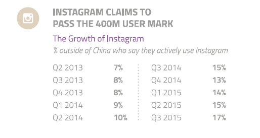 Strong growth in Instagram users over the years (Source : GWI)
Instagram boasts 400 million users worldwide. It's users have shared more than 30 billion photos to date and share approximately 70 million photos every day (Instagram - September 2015).
Brands love Instagram :
56% of the Top 100 US brands are on Instagram.
80% of big brand accounts have more than 10,000 followers.
The interaction has remained strong even though the amount of advertising has reduced: The average engagement on an Instagram post increased by 416% in two years (Forrester Research).
Instagram in the US :
35% of US users connect several times a day (Statista 2015).
27.6% of the US population are estimated to use Instagram (eMarketer)
 The use of Instagram has doubled in the last 2 years (Source : GlobalWebIndex)
Why do online users and consumers generally not like change in logo design, including Instagram's recent change?
High exposure
The logo is a representation that often or not accompanies you in your daily life, which you may feel a strong attachment to. For web service and app logos, such as Facebook, Google, Spotify and Instagram, exposure in terms of their use occurs dozens of times a day. In comparison, you are exposed to public ads much less frequently, such as your gas station's logo and even your food for example.
New Instagram logo and the apps Hyperlapse, Boomerang and Layout
The previous logo was an object, un-stylized.
This logo was well-loved which makes it just that extra bit more difficult for creatives who designed the new logo. When a logo is unloved or ignored (because it is limited to typography for example), the new logo is more likely to be well received. The previous Instagram logo art, represented an object, vintage, Polaroid, rooted in the minds of every generation.
![]()
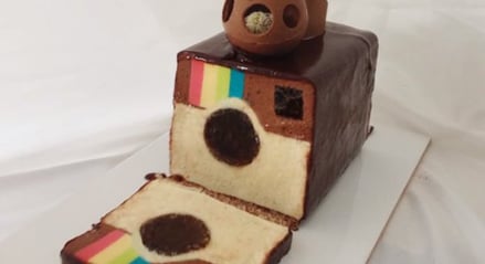
And for the youngest, that is to say, the bulk of Instagram's users, who never experienced the old "Polaroid", the logo was "hot". It was even made in real life and available in cake form ...
With its new more mature logo, Instagram officially enters the big leagues.
 Real Life Instagram design 'Polaroid' camera
Changes in a logo cause an up-stir even when the changes are subtle
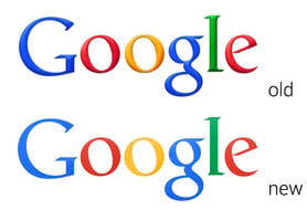 Google changes to a “flat design” in 2013
Some logos, such as the Facebook logo, change very subtly as not to generate big outbreaks or confuse consumers.
Many logos have modernized their typography or switched to "flat design" without causing major reactions simply because the consumer has not even noticed it ...
 Yes, Facebook's logo change slipped under our noses
But even with subtle changes, some web apps and services are so exposed, making consumers more demanding and opposed to any change: so where Facebook's change slipped by, Spotify's change in June 2015 for a simple, more "trendy" color refresh has drawn the wrath of Internet users.
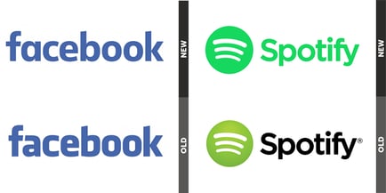 Facebook and Spotify logo changes
The case of Instagram
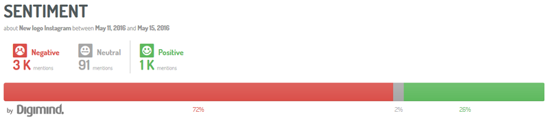 Predictable: 72% of feelings about the new Instagram logo were negative
Instagram's identity change is radical: it exudes "flat design" and simplicity: the more illustrative logo no longer exists, making way for a sleek style, where the only links with the vintage logo are the simplified camera form alongside a rainbow design. Also, given the upsets over much subtler logo changes, it was foreseeable that this clean break is unappealing for online users.
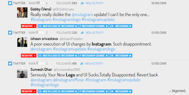 Instagram logo : examples of negative reactions from online users
By analyzing conversations in English, Spanish, French and Italian on social networks during the logo change, we see that the feelings are mostly negative at 72%. The key words are clear: horrible, ugly, hideous, sad ...
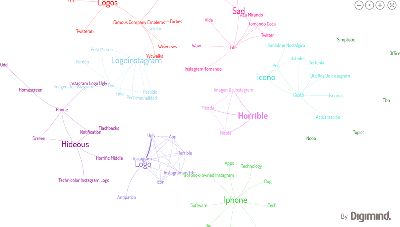 The words associated with the new Insta logo are harsh, but these have become the 'classic' reactions
But 1/4 of users love it, and are not resistant to change 😉
 Instagram Logo: those loving it
And then there are those who act in a more reflective way, speaking via an Instagram post ...
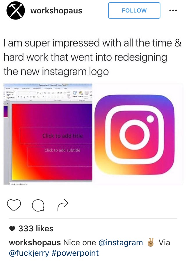 New Logo : reactions were also posted on Instagram
These brands never change
Some brands change little or not at all: Apple, but especially Coca-Cola and General Electric have left their logo practically unchanged over time. There are multiple reasons for this conservatism:
– the logo is not a major issue for brands operating in the B2B market: General Electric, for example.
– the logo is part of the culture and history of a country and is imprinted in the collective memory: Coca-Cola.
– the logo perfectly represents your product and reader audience: The New York Times.
– the logo is stylized and timeless, only requiring quick "refreshments": Apple.
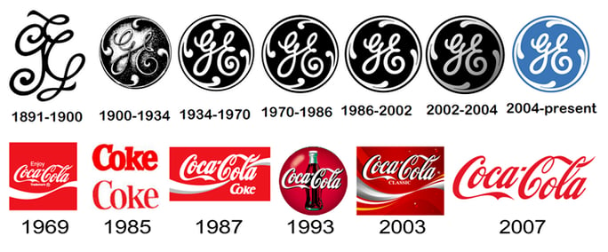 General Electric and Coca-Cola logos over time
And then there are brands who want to change, but who are unsuccessful
Remember the new logo of the clothing brand Gap in October 2010? When it was released there were thousands of online protests, including on the Gap Facebook Page. The brand thought about it, listened ... and returned to the previous logo only 7 days later.
Rest assured: the new Instagram icon will be well praised ... on the launch day of the next new logo in a few years ...

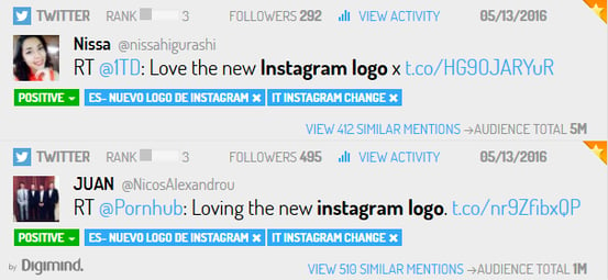
Our Top Tweets of the Week I 05.13.16 #SocialMedia
The Power of GIFs for Brands