Harness the power of Data Visualization with Digimind
Explore search results visually
Data visualization is a powerful way of enhancing information by transforming static text into an array of graphs, tag clouds, maps and timelines. This allows unstructured, often complex information to be presented in an easily understandable format so that non-experts can extract meaningful insights at a glance.
Digimind’s platform combines the strength of its proprietary search engine, which gathers millions of sources daily, with a powerful data visualization tool from Infomous. This enables users to generate an interactive word cloud from any search query they perform.
It sounds interesting, but how does it work?
To answer that, let’s explore the trending news for Apple and Sony over the weekend (June 23rd-24th) and see how the results are displayed.
Apple V Sony - A graphical analysis
A quick search of news results for Apple and Sony reveals the following word cloud:
And if we remove any references to competitors in our search query, our dynamic word cloud is modified accordingly:
To sum up:
Unsurprisingly, Apple gets a lot more coverage, the main topics around the Apple brand talk about the iPad because of the coming release of a new Microsoft tablet. Google reacted to Apple’s last keynote introducing maps by cutting the price for Google maps usage.
Meanwhile, Sony garnered coverage relating to the realease of xperia.
So what's new ?
Let's get nerdy...
A meta engine's job is to interrogate in real time many search engines and to retrieve their results.
The good news is you can now generate the same dynamic word clouds with Digimind Meta Search Engines.
Our pre-set meta engines include:
- Customer reviews
- Blog search
- Trade shows
- Forums
- Job boards
- Science and engineering
- Social docs and Bookmarking platforms
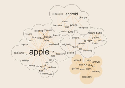
For example, by applying the same process to a search performed in a forum or discussion group you can spot interesting results like this.
One last thing that will please our power users:
Any of the concepts visualized in an infomous representation can easily be added to taylored taxonomies you use to set up graphs, and perform searches on our platform. For instance, if you use an iPad, adding the word tablet to your list of concepts may prove to be very useful.
If you want to find out more about how data visualization tools can bring your data to life, contact us for a demo today!
Digimind partners with De Montfort University
Written by Jerome Maisch
Marketing Manager @digimindci. Passionate about big data & social marketing. Photography, music and hiking lover


